Title : Matador
Author : Marguerite Steen
Cover art : uncredited [New York : Royal Books Giant Editions, #G-14, 1953. “Complete and unexpurgated.” First published in hardcover, 1934, Little, Brown & Co. The Royal reprint features [anon.] front cover art depicting a beautiful Spanish woman in traditional garb with bullfighting tableau in background. Back cover is a collage-like combination of street scene, hillside Spanish village, and scantily clad gypsy dancer]
style ***
substance **
collectibility **
Vintage torero
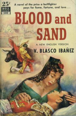
I came across this title a few days ago at a local antiquarian bookstore. I’d never heard of Royal Giant – they really are ‘giant’ books, about double the size of your customary vintage-era paperback. A little research reveals them to be a purveyor of some fairly sensationalist stuff, tending toward exotic and adventure stories in content [1] , with even a few double novels à la Ace in their canon. But the really fun part of this book – aside from the strangely campy/beautiful cover art – is the discovery of the hitherto un-noticed classic era paperback subgenre, that of bullfighting vintage. It’s a rather specialized sub-topic; I don’t recall seeing a lot of other material. There are the obvious titles like Death in the Afternoon and The Brave Bulls. And then there’s Barnaby Conrad’s version of Matador, given a memorable cover by Dell Books and artist Stanley Borack, and of course Blood and Sand (another fine Dell cover), both from the early fifties. Perhaps The Sun Also Rises could be included, but it’s a stretch.
[1] Jimgrim Sahib and Affair in Araby being two examples (but my favorite has to be The Harem of Hsi Men, aka Chin P'ing Mei).
Several factors contributed to this new art form, which sprang seemingly full-blown in all its over-the-top glory : greater competition; the Mickey Spillane influence; evolving tastes; changing reader demographics. But even more to the point was the sudden availability of many veteran pulp artists. The old pulp magazines were a near extinct species by the late 1940s [1], and legendary names such as Rudolph Belarski, Norman Saunders, Raphael De Soto and Earle Bergey were only too ready to lavish their talents on the latest publishing phenomenon [2], in turn bringing a vigorous pulp aesthetic to paperback covers [3]. They were not shy about borrowing ideas from themselves. Indeed, art that had appeared on a periodical cover would later turn up on a paperback, slightly varied or reproduced in toto. The artists further benefited from good timing; these were the early, mystery-dominated years of paperback fiction, filled with the sensation-laced stories of writers like Chandler, Hammett, Cain, Cornell Woolrich, Horace McCoy and Erle Stanley Gardner. [Not so coincidentally, many such authors got their start in the pulps in the 1920s and 1930s].
[1] Peter Haining, The Classic Era of American Pulp Magazines, Chicago, Chicago Review Press, 2001; Robert Lesser, Pulp Art : Original Cover Paintings for the Great American Pulp Magazines, New York, Gramercy Books, 1997; Lee Server, Danger Is My Business : An Illustrated History of the Fabulous Pulp Magazines, San Francisco, Chronicle Books, 1993; Collins, History of Mystery, pp. 32-57.
[2] One important artistic convention which the pulp artists brought to the paperback covers was the portrayal of figures frozen in an instant of maximum dramatic intensity – a tough guy firing a handgun at the muzzle flash moment; a knife plunging into flesh, or a fist tearing into a grimacing face; a terrified heroine captured in mid-scream. Another significant, indeed essential, pulp influence was the depiction of women in various states of dress and undress, mostly the latter (Haining, Classic Era; Lesser, Pulp Art, pp. 97-121; Server, Danger Is My Business, pp. 79-90). “Even the most casual observer of cover designs must have wondered why the shoulder straps of women’s dresses and brassieres were always loose, slipping or undone.” (Bonn, p. 103).
[3] The covers’ lurid-chic flamboyance was rather dubiously spiced by the portrayals of racist, ethnic, and gay & lesbian stereotypes, and the depictions of violence against women. A catalog of these shockingly politically incorrect images* would include : libidinous inner-city blacks**; sinister exotics, especially ‘Oriental’ villains and seductresses; swamp-dwelling Southern White Trash amazons; hot-blooded ‘native’ women; languorous, vaguely sinister lesbian couples; thuggish Slavic torturers and interrogators [a Cold War specialty]; and perhaps most disturbing of all, vivid tableaux of square-jawed tough guys roughing up beautiful women.*** This last example of hardboiled excess was one of the most popular cover themes of the era, and it had a special pungency with its barely concealed delight in the righteous, she-had-it-coming undercurrent. Alas, however unpleasant, un-pc is inevitably a double-edged sword : insensitivity and bad taste are a large part of vintage pb’s charm and camp appeal for today’s audience.
* The insensitivity extended to book titles as well, one of the most notorious examples being 12 Chinks and a Woman (later reissued as the more discreetly titled 12 Chinamen and a Woman).
*** The unpleasantness was dispatched via whips, ropes, fists, butts of guns, chokeholds, yanked heads of hair, and various other means. See : Kiss My Fist! [aka The Dead Stay Dumb] (Eton 112, Harlequin 124)for the ultimate in exuberant tackiness. These types of scenes had a precedent - of a sort - in the earlier 'shudder pulps,' in which scanily clad maidens were constantly menaced with the threat of physical violence and/or torture by arch-fiends, mad scientists, and especially their depraved, barely human (and frequently hypodermic- or knife-wielding) assistants. (Haining, Classic Era, pp. 130-153; Server, Danger is My Business, pp. 105-116). What was different – and unsettling – in the vintage pb depictions was that the character inflicting the violence was not some fiendish ogre or madman, but rather the story’s ‘hero,’ or at least anti-hero.
Farrère, Claude. Fumée d'opium (Black opium). N. Y : Berkley Books Paperback #G-120, 1958. 1st printing. “The shocking ecstasy of the forbidden.” - front cover. Notorious novel of drugs & sex in the Mysterious East, with classic cover art by Robert Maguire of apparition of naked blonde emanating from the smoke of an opium pipe. Arguably Maguire’s signature cover. For more on Maguire see : Jim Silke, Dames, Dolls and Gun Molls : The Art of Robert A. Maguire, Dark Horse, 2009; and, for a great collection of Maguire photos, Illustration Magazine, v1 n3 (Reissue, Summer 2009)pp.4-43.
Kuttner, Henry. The Murder of Ann Avery. New York : Permabooks, 1956. # M-3058. Paperback. A Michael Gray mystery. Cover art : James Meese. “Psychoanalyst solves brutal slaying.” – front cover. James Meese was another of the unsung heroes of golden age paperback cover art; his style combined the glamour of Barye Phillips with the earthy realism of James Avati. His sensitively wrought portrait for Ann Avery gives subtle insights into the subject’s character, and there’s also the wonderful juxtaposition of the beautifully coiffured woman with that of the knife at the center of the table.
Keith, Carlton. Gem of a Murder. N.Y. : Dell Books #1007. First printing, Nov. 1959. Pseudonym of Keith Carlton Robertson. Also released as: The Diamond-Studded Typewriter. Story about four desperate characters in search of a fortune in stolen jewels. Cover art by Harry Schaare depicts a black-haired femme fatale in tight fitting red dress smoking a cigarette as two tough guys tussle in the background next to a car. Schaare was another of the under-rated pb cover artists who were active in the 1950s. His cover for Gem arrives a little late in the classic vintage cycle, but the curvaceous woman in the red dress, along with the generally realistic style, recalls the covers of a decade prior.
Walsh, Thomas. Nightmare in Manhattan. N.Y. : Bantam Books, 1951. #895. Cover art : uncredited. “Complete and unabridged.” The (alas, anonymously produced) cover for Nightmare in Manhattan is a great example of the tough guy school of vintage pb art. Both figures look back at the viewer in an abrupt and obviously startled manner. What are they looking at? The kidnapper? A cop? The setting is rather ambiguous; it could even be a library! And what about the figure in the background with the red cap? Who/what is he? The woman has a classic about-to-scream/shout look, but she is rendered unremarkably and she looks very pale (from fright?). The cover’s highlight is the depiction of the tough guy with the gun and the great detail in the (very intense) left side of his face, dripping blood and all.
Head, Matthew. The Accomplice. N. Y. : Dell, 1949. No. 346. Pseud. John Canaday. Front cover art : ? Back cover : view of 'the strange house of Mimi Decors/scene of weird death' ; i.e. interior decorating shop owned by Mamie Kerr (aka Mimi de Coeur) in Kansas City, Mo. Inset : floor plan of section of the shop. Time of map : 1935. Accomplice is the bizarre story of reincarnation, international intrigue and necrophilia. Cover montage [alas, uncredited] of dead woman with purple hair, with backdrop of Eiffel Tower through window, is one of the most sensationalist covers in the history of vintage paperbacks.
[First published in hardcover, London, Cassell, 1960]
Style ***
Substance **
Collectibility **
I’d never heard of author Hobson before coming across this obscure British reprint. My immediate reaction was that ‘Hank Hobson’ is a better name for a private eye than an author. And it turns out that I wasn’t too far off the mark, in a roundabout sort of way. Evidence is sketchy but it appears that Hank Hobson is a pseudonym for one Harry Hobson, aka Stephen D. Frances, aka Hank Janson. The latter is both the author and detective hero of a series of British pulp novels in the 1940s and 1950s which are probably best remembered today for their unforgettable cheesecake cover art by lingerie specialist Reginald Heade. This cover’s not by Heade, in fact not by anyone in particular. Actually it’s executed in a very different style from Heade’s – a strikingly etched combination of gloominess and brightness. The sharply composed foreground figure in black contrasts nicely with the murky depiction of a body nearby, and all are framed by the vague, quasi-surrealist landscape which seems to suggest a moonlight-reflecting river in the distance. Altogether, a refreshingly different, late vintage British take on the tough formula.
Una Plaga de Espías. “Literatura de espías y otros agents en español.” Collection of spy fiction and especially cover art is an irresistible combination of splashy images and insightful commentary. Maintained by Johny Malone. Text and graphics in Spanish.
Kendrick, Baynard. Odor of Violets (aka Eyes in the Night). N. Y. : Dell, 1947. No. 162. Mapback. Cover art : Gerald Gregg. Map : Ruth Belew. Blind detective Duncan Maclain matches wits with agents of a certain foreign power. Gerald Gregg contributes a stunning, whimsically creepy deco cover which depicts a severed woman’s head on platter, with ax in background.
Greene, Graham. The Third Man. New York : Bantam 1950. No. 797. The classic novel The Third Man is not, strictly speaking, a spy story but it has enough ingredients – a post-WWII black market milieu, shady characters, Cold War tensions, and that most quintessentially intriguish of cities, Vienna – to merit inclusion. The cover for Bantam 797 is a collage-like combination of movie tie-in photo of Alida Valli and Joseph Cotton, with menacing figure of shadow nicely superimposed in background.
MacDonald, John D. Murder for the Bride. [Manchester], UK: Fawcett Gold Medal, 1951(?). Paperback. First edition thus. “Printed at the Philips Park Press and published in Great Britain by Frederick Muller, Ltd.” Murder for the Bride is John D. MacDonald’s second novel and dates from his pre-Travis Magee period. Very much a product of its time, it’s a good example of how the tough school of writers could give the hard-boiled treatment to a Red Scare story. Bride is the story of a man who unknowingly marries a communist agent. She is killed a week or two after their honeymoon, and, Mike Hammer-like, the righteous, bereaved husband searches for her murderer[s], who ultimately turn out to be a nest of reds.
This version is a rare British paperback reissue. The cover art – by Barye Phillips – is the same as the American Gold Medal release: an attractive blonde, presumably the title character, reclines on the floor and wears what appears to be a wedding gown. Cover artist Phillips usually emphasized glamour in his portrayals of women, and this woman has the glamour but a sharp edge as well. Contributing touches are the shadows in the background and a menacing gigantic red hand superimposed over the [anti] heroine, which seems to suggest the Red Menace.
Kirk, Lydia. Postmarked Moscow. New York : Scribner, 1952. "Wife of the ambassador to the USSR, 1949-1952." Cover design by Emil Antonucci. Postmarked Moscow is notable for its breezy style which nicely captures authentic U.S.-U.S.S.R. diplomatic atmosphere during some of the Cold War’s hottest years. Postmarked is not exactly an espionage book and was never released in paperback, but the Scribner hardcover original is worthy of consideration due to the author’s impeccable credentials and the striking cover design (love that red lettering!). See also the author’s Distinguished Service : Lydia Chapin Kirk, Partner in Diplomacy, 1896-1984, Syracuse U. Pr., 2007.
“Paperback cover art reached great popularity by the 1950s. It has its origins in 1930s Pulp art. Paperback books were sold as much for the art on the cover as for the story or author. When sales slowed paperbacks would be re-released with new covers. By the 1980s most paperback art had been replaced by covers with BIG LETTERING.” --Paperback page, from :Illustrations-Art-Antiques
[editor’s note : this is the most succinct – 5 sentences – history of vintage paperback cover art that I’ve read]
Title : The Florentine Dagger [Subtitle : “a novel for amateur detectives.”] First published in hardcover, New York, Boni & Liveright, 1923.
Author : Ben Hecht
Cover art: Bob Ritter
style***
substance **
collectibility ***
Dagger is a potboiler murder mystery which takes place in the New York theatrical milieu. Author Hecht claims he wrote the novel in ten hours because, as he explains, “it should not take more than twice as long to write a baffling mystery as to read one.” Bob Ritter, an artist heretofore unknown to me, contributes a suitably theatrical, quasi-Deco front cover illustration -- an eye-popping, highly stylized depiction of a woman in Itlaian Renaissance garb brandishing a dagger.